Partial support for rendering strings of text
2023-04-03
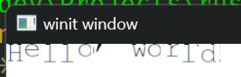
Scratched into a nearby branch is a scattered and unhinged rendition of the words "Hello World!". The text is misaligned and looks similar to that of a ransom message cut out of a magazine. Though misshapen and unnerving, the text is recognizable which represents progress.
Short day today where I worked on setting up the initial text shaping with swash. In doing so a couple bugs were revealed with the text rendering which I plan on investigating tomorrow.
Text shaping in Neovide is a lot more complicated than would normally be required because of it's assumption of text on a grid. Unlike normal text renderers, Neovide doesn't rely on the font to specify glyph positions. Instead it positions them manually and only relies on the font to decide which glyphs to render.
Neovide also uses some lower level features in swash to hook into the shaping process and fallback to different fonts if the initial font used didn't have a necessary glyph for the text at hand.
For this initial test however I went with the simplest setup which uses swash's add_str to iterate over the text and shape it all with one font.
The above code mostly works, but has some problems revealed by the screen shot:
Vertical Positioning
The first issue is that the text is rendered as though it is attached to the top of the window. This is because swash and most fonts use the baseline of the text as the origin of a rendered string rather than the top left. In contrast, my glyph renderer uses the top left. This is a relatively simple issue to fix.
Glyphs Cut Off
The second issue I noticed was that many of the characters
other than the first one are weirdly cut off. The H is
perfect, but all of the other glyphs have a sharp edge on
the right side or in some cases, are rendered completely
incorrectly like the o in "Hello".
I'm not sure what is causing this problem but it shouldn't be too difficult to figure out with a combination of debugging the atlas positions and inspecting the atlas texture in Renderdoc.
Next Steps
After those two issues are resolved, I would like to think about the api currently used in Neovide for text shaping with swash directly and see if I can abstract it's usage into a simple high level api.
I also recently came across a crate called Cosmic Text which advertises rust native font fallback and uses swash. Depending on the license, I may look at adapting that font fallback code for my renderer in order to check off another feature we currently depend on Skia for in Neovide.
Till tomorrow,
Kaylee